Have you ever noticed how certain colors make you feel a certain way? For example, blue skies and green grass make you feel happy and relaxed while dark colors like black and navy can make you feel serious and sophisticated.
This is because colors have psychological effects on people. As an interior designer, it’s important to understand the psychological effects of colors so that you can create a space that makes your clients feel the way they want to feel. In this blog post, we’ll explore the basics of color psychology and how you can use it in your next interior design project.
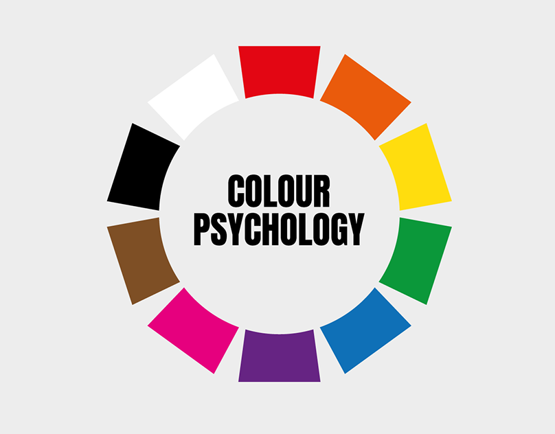
The Basics of Colour Psychology
Color psychology is the study of how colors affect human behavior. It takes into account the physiological and psychological effects of colors. Certain colors can trigger different emotions in people.
As an interior designer, it’s important to be aware of these associations so that you can create a space that elicits the desired emotions in your clients.
Red
Red is the color of passion and energy. It’s perfect for spaces where you want to encourage social interaction, such as dining rooms and living rooms. However, because red is such an intense color, it’s important to use it sparingly. Too much red can be overwhelming, so it’s best to pair it with neutrals like white or cream.
Blue
Blue is the color of peace and tranquility. It’s perfect for bedrooms and bathrooms, where you want to create a serene and calming environment. Blue is also known to promote concentration and focus, making it a good choice for home offices and study areas.
Green
Green is the color of nature and balance. It’s perfect for spaces where you want to create a feeling of harmonies, such as living rooms and kitchens. Green is also known to relieve stress, so it’s a good choice for high-traffic areas like entryways and mudrooms.
Gray
Gray is the color of neutrality and calm. It’s perfect for spaces where you want to create an atmosphere of sophistication, such as dens and libraries. Gray can also be used to tone down other colors so that they’re not too overwhelming.
Yellow
Yellow is the color of happiness and optimism. It’s perfect for spaces where you want to create a cheerful and inviting atmosphere, such as playrooms and sunrooms. Yellow is also known to stimulate the mind, so it’s a good choice for home offices and study areas.
Purple
Purple is the color of royalty and luxury. It’s perfect for spaces where you want to create an atmosphere of sophistication, such as formal living rooms and dining rooms. Purple is also known to promote creativity, so it’s a good choice for home offices and craft rooms.
Color psychology is a complex topic with a lot of nuances. However, understanding the basics will help you create spaces that are more likely to elicit the desired emotions in your clients.
How to Use Colour Psychology in Interior Design
Now that you understand the basics of color psychology, let’s take a look at how you can use it in your interior design projects.
When choosing colors for a space, it’s important to consider the purpose of the space and the feeling that you want to evoke.
- Home Office – For a home office, you’ll want to choose colors that promote concentration and focus. Blue is a good choice for a home office as it has been shown to promote productivity.
- Bedroom – For a bedroom, you’ll want to choose colors that promote relaxation and sleep. Blue and green are both good choices for bedrooms as they are calming colors.
- Living Room – For a living room, you’ll want to choose colors that promote conversation and connection. Red is a good choice for a living room as it has been shown to increase heart rate and energy levels.
- Kitchen – For a kitchen, you’ll want to choose colors that promote appetite and hunger. Red is a good choice for a kitchen as it has been shown to increase appetite.
- Kids’ room – When designing a kid’s room, you’ll want to choose colors that promote creativity and imagination. Yellow is a good choice for a kid’s room as it has been shown to increase creativity.
It’s also important to consider the existing décor in the space when choosing paint colors or fabrics. You want to make sure that the colors you choose complement the existing décor so that the space looks cohesive.
Conclusion
Color psychology is a powerful tool that every interior designer should be aware of. By understanding the psychological effects of colors, you can create a space that makes your clients feel exactly how they want to feel. When choosing paint colors or fabrics for a space, always keep the purpose of the space and the desired feeling in mind. And don’t forget to consider the existing décor so that everything comes together nicely!